Are you specifying bulbs for a high-end project, worried that the wrong choice will lead to client complaints? Cheap bulbs can flicker, render colors poorly, and fail early, undermining a beautifully designed space.
Top designers prioritize four key areas: the quality of light, with a high CRI (90+) and a warm CCT (2200K-2700K); the perfection of control, demanding smooth, deep, flicker-free dimming; the aesthetic of the bulb itself, ensuring it complements the fixture; and commercial-grade reliability with ironclad safety certifications.

I'll never forget a conversation with a renowned lighting designer in the lobby of a newly opened five-star hotel in London. She was almost furious. She pointed up at a magnificent, multi-tiered crystal chandelier. While the fixture was stunning, the light it produced was a disaster. Some bulbs were a slightly different color from others, a few had a nearly invisible flicker, and when the concierge tried to dim the lights for the evening, they stuttered and dropped out in sections. She had specified a high-end bulb, but the contractor, trying to save a few dollars, had swapped them for a cheaper alternative. "They see a bulb," she told me, "I see the soul of the room. That cheap bulb just ripped the soul out of my design." This experience taught me a vital lesson: for professionals, a light bulb isn't a commodity. It is a precision instrument, and they will accept absolutely no compromises on its performance.
What kind of light quality do designers refuse to compromise on?
Are you concerned that your chosen bulbs will make expensive finishes and décor look cheap and lifeless? Bad lighting can make a vibrant red look like a dull brown, completely misrepresenting a designer's vision.
Designers demand an exceptionally high Color Rendering Index (CRI) of 90 or, preferably, 95+, with a strong R9 value for reds. They combine this with a carefully selected warm color temperature (CCT), typically between 2200K and 2700K, to create a specific, intentional mood.

For a lighting designer, light is their paint. The quality of that light determines the richness and accuracy of every color in their palette, which includes everything from the furniture fabric to the food on a plate to a guest's skin tone. The single most important metric for this is the Color Rendering Index (CRI). A designer simply will not accept a standard CRI of 80, which is common in retail bulbs. This level of color accuracy is too low and will leave colors looking unsaturated. A professional project begins with a CRI of 90 as the absolute minimum. For high-end luxury spaces, they will often specify 95+ CRI to achieve a level of color fidelity that is nearly identical to natural sunlight. Equally important is the color temperature (CCT), which sets the entire emotional tone of a room. Designers use CCT with intention. They might choose a very warm 2200K to create a dramatic, intimate, candle-lit feel in a bar, or a classic 2700K to provide a comfortable, welcoming, and high-end residential feel in a hotel guest room. The light must be both technically accurate (high CRI) and emotionally appropriate (correct CCT).
The Metrics of Mood and Accuracy
A professional specification goes far beyond "warm white" or "soft white."
- CRI 90 vs. CRI 951: While CRI 90 is good, CRI 95 is the gold standard for luxury applications. The difference is most noticeable in the subtle shades, deep colors, and natural look of skin tones. A CRI 95 bulb makes a space feel more vibrant and "real."
- The Importance of R9 (Red)2: The standard CRI calculation is an average that does not include deep red. R9 is a separate score for this crucial color. A lighting designer will always look for a high R9 value (ideally >50, with >80 being excellent) because it ensures that rich woods, red fabrics, and certain foods look deep and saturated, not dull and brownish.
- Intentional Color Temperature (CCT)3: The choice of Kelvin is a deliberate design decision.
- 2200K-2400K4: Used to create drama, romance, and intimacy. Perfect for cocktail lounges, fine dining, and specific historic settings.
- 2700K: The standard for high-end hospitality. It replicates the familiar, comfortable glow of an old incandescent bulb, creating a welcoming and luxurious ambiance. It's the versatile workhorse for lobbies, guest rooms, and restaurants.
| Quality Metric | "Good Enough" (Retail Grade) | Professional Designer Specification | The Resulting Atmosphere |
|---|---|---|---|
| CRI | 80-85 | 90+, preferably 95+ | Colors are flat and inaccurate vs. Colors are rich, deep, and true-to-life. |
| R9 (Red) | Low / Not specified | >50, preferably >80 | Important red tones look muted vs. Reds are vibrant and luxurious. |
| CCT | Often limited (e.g., only 2700K) | Precise choice from 2200K to 2700K | "One-size-fits-all" light vs. A carefully curated, intentional mood. |
For a designer, light quality isn't a feature; it is the fundamental starting point of their entire design concept. As a manufacturer, this means our LED chips and phosphor chemistry have to be the best in the industry.
Why is perfect dimming a non-negotiable for lighting designers?
Have you ever seen an expensive lighting installation ruined by lights that flicker, buzz, or pop on and off when dimmed? This is a common failure point that can completely destroy the intended ambiance of a space.
Designers require smooth, continuous, and flicker-free dimming down to extremely low levels (1% or less). They demand bulbs with high-quality drivers that are proven to be compatible with professional-grade dimming systems (like Lutron and Crestron) to create dynamic and layered lighting scenes.

A lighting designer rarely designs for a single light level. They design "scenes" for different times of day and different functions: a bright, welcoming "arrival" scene, a softer "dinner" scene, a dramatic, low-light "late evening" scene. The ability to transition seamlessly between these scenes is what brings a space to life. This is why dimming performance is arguably the most critical technical function they evaluate. Any hint of flicker, even if it's almost imperceptible, is an instant rejection because it creates a sense of unease and cheapness. Any audible buzz from the bulb is also an immediate failure. Most importantly, the dimming range must be deep and wide. A cheap bulb might only dim to 20% before it cuts out. A designer needs a bulb that can dim smoothly all the way down to a 1% "glow" to achieve true intimacy and drama. This level of performance has nothing to do with the LED chips and everything to do with the sophistication of the internal driver electronics. It is the single biggest differentiator between a professional-grade bulb and a consumer product.
The Science of Seamless Control
Perfect dimming is the result of superior engineering.
- The Driver is King: The internal driver is a miniature computer that interprets the signals from the dimmer and delivers a precise, stable current to the LEDs. High-quality drivers use advanced circuitry to provide clean power at every light level, eliminating flicker and noise.
- Deep Dimming (1%)5: The ability to maintain a stable, pleasing light at extremely low output is the hallmark of a professional driver. This allows for the creation of very subtle, moody scenes that are impossible with standard bulbs.
- Compatibility is Key6: A professional designer works with professional control systems7 from brands like Lutron, Crestron, Legrand, and others. As a manufacturer, we at Hongyu Bulb must invest in rigorous compatibility testing with these systems. We have to be able to provide our clients with a list of compatible dimmers to guarantee a plug-and-play experience and eliminate the risk of performance issues on a job site. This is a critical service that saves designers time and reduces their risk.
| Dimming Feature | Standard Bulb Performance | Designer-Grade Bulb Performance | Impact on the Space | |
|---|---|---|---|---|
| Dimming Range | Limited (dims to 20-30%) | Deep (dims to 1% or less) | Cannot achieve truly intimate scenes. | Allows for complete atmospheric control. |
| Smoothness | Can "step" or "jump" between levels. | Perfectly smooth, continuous dimming. | Distracting and looks unprofessional. | Seamless, luxurious transitions. |
| Flicker/Noise | Prone to flicker and audible buzz. | Zero flicker, zero noise8. | Creates an uncomfortable and cheap-feeling environment. | Ensures guest comfort and a premium feel. |
| Compatibility | Hit-or-miss with pro systems. | Tested and certified for major control systems. | High risk of project delays and troubleshooting. | Guaranteed performance and peace of mind. |
For a lighting designer, a bulb that doesn't dim perfectly is not a functional tool, and they will not specify it.
How does the physical appearance of the bulb impact a designer's choice?
Are you still thinking of a light bulb as just a piece of hardware? In the decorative fixtures used in high-end projects, the bulb is an essential part of the aesthetic, and an ugly one can ruin the look of an expensive chandelier.
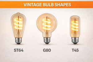
Designers treat the bulb as a decorative object. They choose specific shapes (like bent-tip or torpedo), glass finishes (clear, frosted, or amber-tinted), and filament styles (curved loop, spiral) that actively enhance the design of the fixture itself, both when it is on and when it is off.

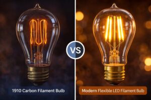
In luxury hospitality and residential projects, candelabra bulbs are rarely hidden. They are prominently displayed in chandeliers, wall sconces, and pendants. A lighting designer understands that the bulb's appearance during the daytime, when it is switched off, is just as important as the light it produces at night. The bulb is a finishing touch, like the hardware on a fine piece of furniture. A generic, plastic-base, plain-looking LED bulb can make a ten-thousand-dollar custom fixture look cheap. For this reason, designers are incredibly particular about the physical form of the bulb. They will choose a "bent-tip" shape to mimic a candle flame in a traditional chandelier. They will specify an amber or gold-tinted glass to add warmth and a vintage character to a space. They will look at the internal filament structure, preferring an elegant curved loop over simple straight lines. Every one of these details contributes to the story the fixture and the room are telling. It is a level of detail that separates a truly considered design from a basic installation.
Building a Beautiful Bulb
A designer looks for a combination of these aesthetic elements.
- Shape and Silhouette: The form must complement the fixture.
- Bent-Tip (CA shape): The classic "flame" look. Essential for traditional, historic, and ornate chandeliers.
- Torpedo (B shape): A clean, versatile, conical shape that works well in a huge range of fixtures, from classic to contemporary.
- Glass Finish9: The glass itself sets a mood.
- Amber/Gold Tint: Instantly creates a warm, vintage, and cozy feeling. The bulb looks beautiful even when off. This is a designer favorite for hospitality.
- Clear: Provides the most sparkle and brilliance. The ideal choice for crystal chandeliers where the goal is to maximize refraction and "glitter."
- Frosted/Satin: Creates a soft, diffuse, and glare-free glow. Perfect for modern fixtures or applications where a gentle, even light is desired.
- Filament Design10: In clear bulbs, the filament is a key visual element.
- Curved Loop: The most popular and elegant style. It provides a soft, organic look that recalls early Edison bulbs.
- Spiral: A more intricate and decorative option that becomes a talking point in itself.
| Aesthetic Choice | Design Intent | Typical Application |
|---|---|---|
| Bent-Tip + Amber Glass | Historic, Romantic, Dramatic | Fine dining restaurants, classic hotel lobbies, period homes. |
| Torpedo + Clear Glass | Sparkling, Brilliant, Elegant | Crystal chandeliers in ballrooms, grand entryways. |
| Torpedo + Frosted Glass | Modern, Soft, Glare-Free | Contemporary sconces, bathroom vanity lights, minimalist fixtures. |
As a manufacturer targeting professional designers, we must offer a wide portfolio of these aesthetic options. A single "one-size-fits-all" bulb is not enough to meet the creative demands of a professional designer.
What do designers demand for long-term reliability and consistency?
Is your client worried about the hassle of replacing bulbs in a 30-foot high chandelier? A lighting designer's reputation depends on the project looking perfect not just on opening day, but for years to come.
Designers specify bulbs with proven, commercial-grade reliability, demanding an L70 lifespan of 25,000+ hours and a strong warranty (3-5 years). Crucially, they also require perfect batch-to-batch color consistency to ensure every single bulb in a large installation is visually identical.

A lighting designer's job doesn't end when the project is handed over. If bulbs start failing prematurely or if a replacement bulb doesn't perfectly match the color of the originals, they are the ones who get the angry call from the client. Their professional reputation is on the line. For this reason, they are extremely risk-averse and will only specify products from manufacturers they trust to deliver exceptional reliability and consistency. Reliability means the bulb is built to last in a commercial setting, with excellent thermal management (aluminum heat sinks, not plastic) and high-quality internal components. This is what allows for a long L70 lifespan, minimizing the costly and disruptive maintenance of replacing bulbs in hard-to-reach locations. Consistency is just as important. In a chandelier with 100 bulbs, even a tiny variation in the color temperature from one bulb to the next is immediately obvious and looks incredibly unprofessional. Designers need an absolute guarantee from the manufacturer that every bulb in an order, and any future replacement bulbs, will come from the same tightly controlled color "bin" (measured in SDCM or MacAdam Ellipses).
The Pillars of Professional Trust
These are the features that give a designer peace of mind.
- Commercial-Grade Construction: A designer can often feel the quality. They look for a heavy, solid bulb with an aluminum chassis that can effectively dissipate heat, rather than a lightweight, all-plastic bulb destined for early failure.
- Long L70 Lifespan: An L70 of 25,000 to 50,000 hours is the standard expectation. This ensures that re-lamping is a rare, planned event, not a constant maintenance issue for their client.
- Strict Color Consistency (Binning): Professionals may specify a color consistency of less than 3 SDCM (Standard Deviation of Color Matching). This is a technical way of saying that the color difference between any two bulbs will be virtually indistinguishable to the human eye. This is a critical manufacturing discipline that separates high-quality suppliers from the rest.
- Strong Warranty: A 3- to 5-year warranty is a designer's insurance policy. It shows that the manufacturer stands behind the engineering of their product and will be there to support them if anything goes wrong.
| Reliability Factor | A Designer's Concern | The Professional Solution |
|---|---|---|
| Premature Failures | "My client will be calling me to complain in a year." | Commercial-grade build with a 25,000+ hour L70 lifespan. |
| Inconsistent Colors | "The chandelier will look like a checkerboard of different whites." | Strict <3 SDCM color binning for perfect uniformity. |
| Lack of Support | "What happens if a bulb is dead on arrival or fails early?" | A comprehensive 3- to 5-year manufacturer's warranty. |
This focus on reliability and consistency is how a manufacturer like Hongyu Bulb builds long-term relationships with the professional design community. We are not just selling a product; we are selling a promise of performance.
Conclusion
Professional designers choose LED candelabra bulbs by insisting on a total package: beautiful and accurate light (high CRI, specific CCT), flawless control (deep dimming), elegant physical design to complement the fixture, and uncompromising commercial-grade reliability.
Understanding the difference can help you choose the right lighting for luxury applications, enhancing the vibrancy of colors. ↩
Exploring R9's significance will deepen your knowledge of how lighting affects color perception, especially for rich tones. ↩
Learning about CCT choices can elevate your design skills, allowing you to create the perfect ambiance for any space. ↩
Discover how specific Kelvin ranges can transform the mood of a space, making it ideal for various settings. ↩
Explore this link to understand how Deep Dimming enhances lighting design and creates the perfect ambiance. ↩
Learn why compatibility ensures seamless integration and performance in professional lighting setups. ↩
Find out about the leading professional control systems that ensure optimal lighting performance. ↩
Discover how eliminating flicker and noise can enhance comfort and quality in any space. ↩
Explore this link to understand how various glass finishes can enhance the aesthetic appeal of lighting designs. ↩
Discover the significance of filament design in creating unique lighting effects and styles. ↩